Responsive Web Design
Employ the Flexibility of a Responsive Web Design
It’s here to stay and you can no longer ignore it: mobile searching. With 20 percent of Google searches being done on a mobile device of some kind and 25 percent of Internet users only accessing the Internet via a tablet or smart phone these days, the end result is clear. You must make your site adaptable to all kinds of devices – not just desktops anymore.
Dubbed the “Post PC era,” your users are searching for you on tablets, smart phones, laptops and other similar devices while on the go. Not many people are tied to a desktop anymore. They want to find out which restaurant to hit while in the car on the way out. They see something in a store they want and they search for the lowest prices in the area as they’re walking the mall. Do you want those consumers to find your website yet realize it’s not compatible with their device? This is a critical juncture in the consumer lifecycle. If you lose them now, you may never get them back. They may just move on to a competitor who has a more mobile-friendly site that makes navigation easier.
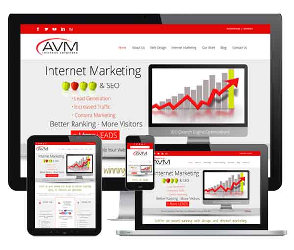
Retain more customer interest with a responsive web design.
This is what AVM Internet Solutions wants to help you avoid. Retain more customer interest with a responsive web design. Give your customers an optimal viewing experience that automatically resizes to fit their screen of choice and allows them to more readily pan, scroll and click no matter what device they are on at the moment. You spent a lot of time on creating and designing your website. Don’t let it all go to waste on a site that won’t load properly when your potential customers are trying to find out more information. This point of failure can be avoided with a solid RWD plan. We will work with you to ensure your website will be viewed the way it was intended.
Did you know that three quarters of all web users make immediate judgments about the credibility and reputation of your company based on your site’s design? That’s why RWD is so important because it can adapt to any screen size instantly – from PCs to tablets to phones. The overwhelming amount of mobile users has even prompted Google – the king of search engines – to proclaim responsive website design a necessary best practice for any company.
Take a moment to consider what your potential customers are doing on their mobile devices. They research products, find store locations, look up reviews, read articles, seek out contact information, get directions, post on social media and much more. They also use apps – lots of them. There are more than one million apps in Apple’s store alone. We can help you ensure your mobile web design is top notch and create easy-to use mobile apps for your company as well.
Accommodate a range of screen sizes on devices
Our responsive web design services ensure the fluidity of your images and the compact nature of your text so that consumers get a customized view of your site that can accommodate a range of screen sizes and even web browsers. Convert leads into sales easily with a mobile website that leverages our in-depth knowledge of the psychology behind why and what customers buy. As such, we enhance your website through user experience (UX) design and clear calls to action. Get in touch with the experts here at AVM Internet Solutions now to explore your RWD options today.